Brush View and Brushes Group
The Brush view allows you to modify your drawing elements with options such as colors, gradients, light angles, and other special effects to achieve a truly custom look.
The Brushes group, found on the Home tab, is another way you can quickly apply fill, stroke, or background color to an element on the canvas.
Color, Brush, CompoundBrush
Most element properties are “CompoundBrush” types, but some are also just “Brush” or even “Color”, so it might be useful to understand the three different types:
- A Color is a simple solid color, represented with an ARGB value, for example, Blue or Pink. Or, a reference to a state text color defined in a Text Group using the following syntax: [TextGroupName].[Value].
- A Brush is either a solid color brush or a gradient brush (linear or radial). The string representation can contain many ARGB values and control characters.
- A CompoundBrush represents a blinking brush and consists of two brushes, the main brush and the blink brush.
Fills and Strokes
The most common uses of the Brush view revolve around the fill and stroke functions. Fill refers to the process of coloring or shading the area inside of a geometric shape, whereas stroke refers to the font color or the line that serves as the path or border of the drawing element. You can apply a fill or a stroke to a drawing element by using any of the sixteen base colors, by either specifying a custom color from the ARGB using slider controls, by manually entering a hexadecimal color code, or by entering the name of a color from the list of HTML Literal Word Colors, for example, ‘Blue.’
If you see a color anywhere on the monitor screen that you would like to apply to your drawing elements, you can use the color eyedropper to capture it instead of trying to determine the color’s custom color through the slider controls.
Finally, you can use the HSV palette to specify the hue, saturation, and light value of the color to fine-tune your selection.
Additional Color Controls
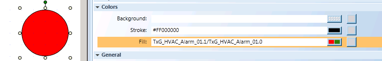
Additional color controls allow you to select the background color of a drawing element, apply a solid color to a drawing element, or specify a 2-state color that blinks alternately between the two colors you choose. The compound brushes in the Brush Editor, allow you to select a color for the “on” state of the blink, and the “off” state of the blink. Whereas, the Blink property, in the Property view of the selected element, affects the overall visibility of the entire element on the canvas.
Linear and Radial Gradients
Linear and radial gradients allow you to gradually blend colors together. Radial gradients blend colors while radiating or branching out in all directions from a common, specified center, while linear gradients blend colors along a straight path.
When you apply a radial gradient to an object, if the focal point is configured outside its radial ellipse, you may have subtle differences between what is displayed on the install client (.CCG/.CCS) and what is displayed in the Flex Client application (.SVG). To minimize these differences, in the Brush Editor check the Absolute checkbox. This is especially advisable for Text elements with gradients applied to them.
If you apply a radial gradient with different values for radius x and y, the color will look different in the Flex client. This is because the radial gradient in an SVG only uses one parameter for the radius property, which is applied to both X and Y. Therefore, to prevent any unexpected differences in the Flex client, it is recommended you use the same value for radius X and Y when configuring your graphics in the installed client.
Brush view provides predefined gradient Stops in the form of drop-down menus that allow you to move your mouse over them to see what your element will look like before you actually select the stop. You can also specify a gradient fill by using the Gradient View bar or by entering values into the Direct Radial or Direct Linear Gradient Control fields.
You can achieve additional special effects with a gradient fill by employing the Mapping mode options (Padded, Reflect, or Repeat), the Adorners options, and the Angle Control option—which allows you to choose the angle of the light for a gradient fill.
Copy and Paste
The copy and paste functions allow you to copy the content of one element and paste it into one or more selected elements. This can save you time and effort when you have multiple graphical elements that all need the same look.
State Color Overview
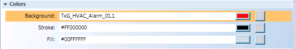
In addition to selecting and modifying element color properties with the Brush Editor and the Brushes group, you can also determine color by using references to existing Text Group tables that among other definitions (icon and text) have state colors defined for a data point’s property, depending on its Value.
These state settings are created in the Text Group Editor. Each Text Group is stored under Management View > Libraries under the associated library.
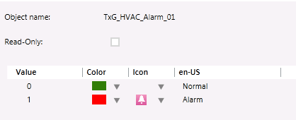
For example, if you open the Text Group, HVAC_Alarm_01 in the Text Group Editor, you see that it has two states defined, Normal and Alarm. Each state has the Value associated with it, as well as the assigned Color and an Icon.
Referencing Color in Text Group Tables:
There are two methods you can use in the Graphics Editor to reference the Text Group tables Color and Value information: Entering the correct syntax to reference the information from the Text Group, or, drag the Text Group object from the appropriate Library in System Browser and drop it into the supported field in the Graphics Editor.
The syntax to manually reference state colors in a Text Group, is:
TxG_[TextGroupName].[Value]
For example, using the Text Group HVAC_Alarm_01 as an example, we can add the following references to element properties:
- TxG_HVAC_Alarm_01.1 = This references the Normal state (see above) which is represented by the Color green.
- TxG_HVAC_Alarm_01.2 = This references the Alarm state, which is represented by the Color red.
Please note, that the Object Name of the Text Group table may not be the name you see in System Browser. Always use the Object Name, which prefaces the Text Group with “TxG_”
Supported Properties and Fields
Most element color properties in the Graphics Editor support the state color references. Below is a list of areas that support manual or drag references to state colors.
- Element Properties
- Fill
- Stroke
- Background
- Graphic Properties
- Background color
- Grid and Guideline colors
- Blinking supported
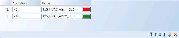
- Expressions and Substitutions in the Evaluation Editor
- Value field
- Expression field – Use double quotes when entering Text Group reference.
- Conditions in the Evaluation Editor
HTML Literal Word Colors Table
The following table shows the 140 HTML literal word colors in alphabetical order from left to right and top to bottom. Instead of specifying hexadecimal color codes, you can enter any of the colors from the following table. Go to the Views tab, and select Brush, ARGB and then #.
HTML Literal Word Colors | |||
Aliceblue | Antiquewhite | Aqua | Aquamarine |
Azure | Beige | Bisque | Black |
Blanchedalmond | Blue | Blueviolet | Brown |
Burlywood | Cadetblue | Chartreuse | Chocolate |
Coral | Cornflowerblue | Cornsilk | Crimson |
Cyan | Darkblue | Darkcyan | Darkgoldenrod |
Darkgray | Darkgreen | Darkkhaki | Darkmagenta |
Darkolivegreen | Darkorange | Darkorchid | Darkred |
Darksalmon | Darkseagreen | Darkslateblue | Darkslategray |
Darkturquoise | Darkviolet | Deeppink | Deepskyblue |
Dimgray | Dodgerblue | Firebrick | Floralwhite |
Forestgreen | Fuchsia | Gainsboro | Ghostwhite |
Gold | Goldenrod | Gray | Green |
Greenyellow | Honeydew | Hotpink | Indianred |
Indigo | Ivory | Khaki | Lavender |
Lavenderblush | Lawngreen | Lemonchiffon | Lightblue |
Lightcoral | Lightcyan | Lightgoldenrodyellow | Lightgreen |
Lightgrey | Lightpink | Lightsalmon | Lightseagreen |
Lightskyblue | Lightslategray | Lightsteelblue | Lightyellow |
Lime | Limegreen | Linen | Magenta |
Maroon | mediumaquamarine | Mediumblue | Mediumorchid |
Mediumpurple | Mediumseagreen | Mediumslateblue | Mediumspringgreen |
Mediumturquoise | Mediumvioletred | Midnightblue | Mintcream |
Mistyrose | Moccasin | Navajowhite | Navy |
Oldlace | Olive | Olivedrab | Orange |
Orangered | Orchid | Palegoldenrod | Palegreen |
Paleturquoise | Palevioletred | Papayawhip | Peachpuff |
Peru | Pink | Plum | Powderblue |
Purple | Red | Rosybrown | Royalblue |
Saddlebrown | Salmon | Sandybrown | Seagreen |
Seashell | Sienna | Silver | Skyblue |
Slateblue | Slategray | Snow | Springgreen |
Steelblue | Tan | Teal | Thistle |
Tomato | Turquoise | Violet | Wheat |
White | Whitesmoke | Yellow | Yellowgreen |
Related Topics
For related procedures, see Applying Brush Editor Formats.
For workspace overview, see the following: